Misleading data visualization could be one of the gravest sins of a data analyst. Firstly, as analysts, we must ensure that such mistakes do not happen from our end. Secondly, it is also important to understand how to spot these mistakes. Finally, we look at a set of guiding principles that can provide us with a way to validate any visualization correct errors before they are presented/published.
Contents
What is misrepresentation of data?
Data representation is the visual depiction of useful information. However, it is even more important to represent the insights correctly. Any misrepresentation of data will lead to errors of judgment. The results could be catastrophic in the worst cases. On the other hand, it could be an embarrassment at the workplace is not the worst case.
DATA ANALYSIS GUIDE FOR MANAGERS: how to analyze data like Sherlock?
➤ Click here to read more in our detailed article on data analysis.
Different reasons for misleading visualization of data
Data is misrepresented if it qualifies one or more of the following criteria:
- Unethical manipulation of data in analysis phase
- Unethical manipulation of data in visualization phase
- Inconsistency errors
- Incompetency errors
The first two types of errors are unethical while the last two are follies. Unethical errors are purposeful and driven by low professional standards. Folly mistakes are caused due to a lack of skill or due to oversight. Although both these types of mistakes can lead to misleading data visualization, it is usually not possible to say for sure which type of error it is as an observer. A deeper dive into the raw data and analyzed data may reveal the genesis.
This typology may be more helpful as a prognostic rather than a diagnostic tool. In other words, this will help us more in preventing errors than in finding the source of errors.
Unethical manipulation of data in analysis phase
Data can be wrongly manipulated in the analysis phase itself. Sadly, it is far more common than we may imagine. Such manipulation stems from the need to force a particular ideology, perspective, or result. One may selectively collect data. Further, one may selectively filter the data for analysis. Also, there are times when someone may hide an unsupported hypothesis. At times, people may even fabricate data to show the results. All of these are considered to be unethical practices.
Unethical manipulation of data in visualization phase
The second layer of misrepresentation comes from the visualization phase. In this phase, the analyst already has the result. They may purposefully manipulate what and how the insights are presented. Again, they may keep the unfavorable findings to themselves. Alternatively, there are more technical ways to misrepresent data. We shall discuss these in detail later. The way we prepare the charts and graphics has a very strong impact on what story is being conveyed. Some
Inconsistency errors
The inconsistency errors also lead to wrongly interpreted data. In this case, the misleading data visualization may convey the wrong message. For instance, it is common practice to represent the speed of a vehicle in units like mph or kph. However, if we use an uncommon, although scientifically more appropriate unit like meters/second, it may confuse individuals. Also, a major proportion of the audience from the US may not interpret kph correctly. In the same way, the French audience may not interpret speed data represented as mph. When you are publishing the data for an international audience, it makes sense to provide both the SI unit as well as the metric unit for the convenience of the readers.
Incompetency errors
One of the common mistakes that may lead to such errors is by formatting the scale incorrectly. For instance, let us consider that we want to depict the range of heights of individuals in a group. A simple method to visualize this data would be to use a bar chart. In this chart, if we use the units of height as 2m and the range of scale between 0m to 10m, then the output may not clearly show the individual differences in height. Similarly, the opposite happens when we compress the scale. It may amplify the differences between values. A suitable judgment from the analyst is required to represent the differences appropriately.
How to avoid data misrepresentation?
Unethical manipulation of data in analysis phase
| Problem statement | Have you defined your problem clearly, with required variables? |
| Data Collection | Correct source |
| Random sampling | |
| Correct representation | |
| Data Analysis | Pre-determined criteria |
| Avoid p-value hacking | |
| Uniform methodology |
Unethical manipulation of data in visualization phase
| Type of visualization | Use a visualization that enables correct inference |
| Visualization methodology | Unclutter the data with only top variables |
| Use standard and meaningful scales for axes and data | |
| Don’t hide unfavorable findings |
Inconsistency errors
| Visualization technique | Use consistent and commonly used scale |
| Use the same scale for different charts having similar data | |
| Data representation | Refrain from using too many variables |
| Never represent unrelated variables as related ones |
Incompetency errors
| Data representation | Use labels for axes and titles for the visualization |
| Use pie chart sparingly (may be appropriate for percentage data) | |
| Normalize data that has a lot of variances | |
| Data Analysis | Data that has random fluctuations must be averaged to eliminate these variations. |
Misleading data visualization examples
We shall look at some illustrative examples of misleading data visualization. This is an exercise in analysis and not meant to demean or find faults in these publication outlets. Also, the charts and corrected visualizations are provided for educational purposes only. Management Weekly holds no copyright for these materials and they are provided for illustration.
1. Gun deaths vs ‘stand your ground’ campaign
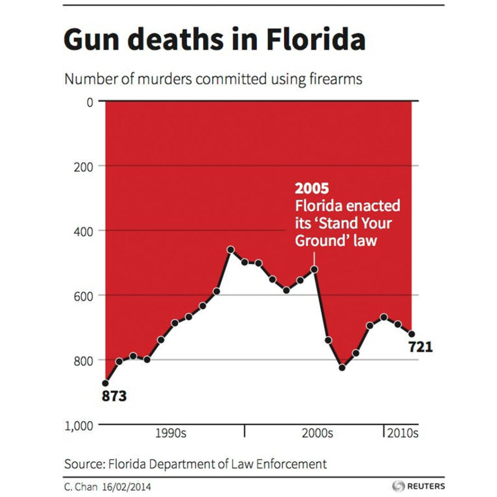
How people interpret this chart?
This chart is supposed to show the number of gun deaths in Florida over the period of time. In any traditional chart, the X-axis should have represented the time and the Y-axis should have represented the number of murders using firearms. Therefore, by default, you will infer that the cases of number of deaths have gone down after 2005. The chart tries to show that the ‘stand your ground’ law was meant to reduce the number of deaths due to firearms.
What is wrong with this chart?
This chart is fundamentally flawed. The biggest problem with this chart is that the Y-axis is inverted. In plain English, the Y-axis is supposed to increase from the bottom to the top side. However, this chart shows the opposite. As you move down, there are more deaths due to firearms. We are accustomed to reading any chart in the traditional way. A reader who is in a hurry or not vigilant may infer that the law reduced the number of gun deaths.
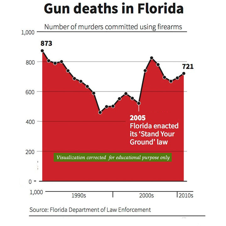
Correct representation
The number of gun deaths increased from about 500 to 800 after the law was passed. A correctly visualized graph would show this trend in the traditional form.
It is important to follow certain conventions to avoid misleading data visualizations. It is evident that this chart has been purposefully manipulated to propagate a particular political agenda. A similar story may be used by firms as well to ameliorate their communications.
The chart on the right follows the conventional trendline for the y-axis. Therefore, it reduces the chances of reading the data in the wrong manner. The readers must also note that even after correct representation, this chart must not be taken too seriously. The correlation of variables is not causation. A deep dive into this matter may reveal whether the gun law had a positive, negative, or no effect on the number of deaths.
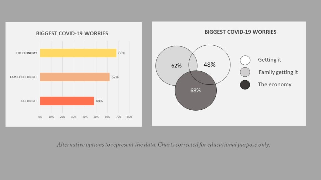
2. Biggest covid worries
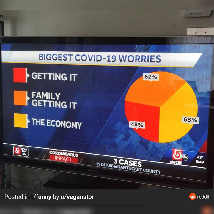
How people interpret this chart?
A pie chart is interpreted in the form of the proportion. In plain English, it means that each component of a pie chart shows the percentage of that particular category. The underlying assumption in any pie chart is that these parts should form a total of 1. Therefore, each percentage should add to a total of 100%. In this particular chart, the people may assume that around half the people (48%) primarily worry about getting the virus.
What is wrong with this chart ?
This chart wrongly depicts the percentage of each of these components. If you want to represent any data in the form of a pie chart, you should always do by finding the proportion in terms of the whole. If you have got data that has an overlap, such as this case, then you must represent it differently.
Correct representation
There could be many different ways to represent this data correctly. For example, you could simply draw a Venn diagram for three different cases. A Venn diagram is a great way to show the different categories, which may have an overlap with each other. Secondly, this data could also be represented in the form of a bar chart.