The graphical representation of data enables us to present information in such a way that is not possible by any other means. Research has shown that data visualization increases the acceptance of information compared to other approaches. Therefore, it is essential to understand what is the best way to visualize data.
Contents
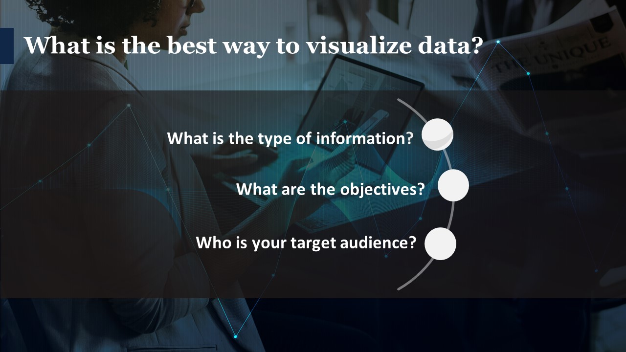
What is the best way to visualize data?
Although there is no right answer to this question, the best way is dependent on a number of factors. However, you can use a step by approach to finding out the best way to represent your data. Answering these questions will give you some clarity.
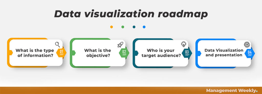
1. What is the type of information?
This is the primary question you should be asking before jumping into data visualization. In order to do this, we need to look at the information that we have at hand. Firstly, information can be broadly categorized into two types: real-world and empirical data. In the first case, we attempt to model real-world objects. On the other hand, the empirical data captures a specific aspect of the real world or their interaction with one another.
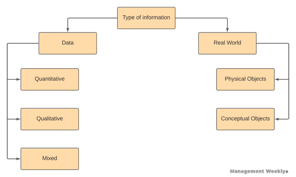
For instance, real-world information can represent a physical object such as a ball kept on a table. We can see the dimensions and position of real-world objects and represent them visually. Although, we may choose to reduce or increase the scale (size of the object) as per the need. On the other hand, we may also have conceptual objects like forces acting on the ball. Although we cannot see these forces, we can objectively measure them and represent them visually.
The second type of information is empirical data. When we have to understand the pattern in individual cases, we have to take a large number of samples. We may capture this type of data numerically (quantitatively), non-numerically (qualitatively), or a mix of both (mixed data).
2. What are the objectives?
There are four broad objectives of data visualization (Berinato, 2016):
- Illustration of an idea
- Idea generation
- Discovery through visual representation
- Representation of simple relationships between variables
Illustration of an idea
We need to represent some ideas commonly in the presentations. In the business context, it can be the representations like BCG matrix or ‘customer journey mapping.’ Although it may take time to develop such visualizations, it helps in presenting your information. It would also save time for your audience since they can absorb the insights more readily.
Idea generation
Idea generation is the real-time visualization technique. For instance, you may use a method like mind-mapping to take a note of the idea generation in a session. Firstly, such representation helps us in keeping track of a lot of information that is difficult to remember. Secondly, it also helps in organizing the complexity of the information. This shall help in making sense of data. Thirdly, it may help us in quickly going through the discussion later.
Discovery through visual representation
Sometimes, visual representation gives us totally new insights. An example of such representation is a bar chart that compares the average ticket size (purchase or basket size) of female vs male customers at a store. We can use both a table and a bar chart in this case. However, most viewers will process a bar chart more easily. Taking it a step further, you may develop an infographic representing female and male figures to make it more appealing.
Representation of simple relationships between variables
Finally, we come to the 4th type of data representation. In this type, we try to represent the relationship between variables. A univariate data analysis looks at a visual representation of a single variable. For example, if we want to visualize what amount of salary is more common than others, then it is analyzed and represented as a univariate. On the other hand, if we want to see, how salary varies with the level of education, then we have to represent that as a multivariate. Managers often need to use multiple regression to find patterns in data.
Therefore, your objective will define the type of visualization method that you will use. These methods. Can range from fairly simple ones like bar charts to a more advanced and technically challenging one like infographics. Our next question will help us answer this choice. The choice of a particular visualization method is dependent on the target audience.
3. Who is your target audience?
When you are trying to visualize the data for a less educated audience, then your approach should be to represent the information in the easiest way possible. Your driving concern should be the representation of data that is both easy to read and easy to understand. One of the ways of doing this is using a summarized version of data.
On the other hand, if your target audience is well informed then you may want to provide them with advanced details about the data. However, the goal of the analyst should still be to summarize the information in a digestible form. You should try to avoid using too many graphs and too many charts that can digress you from the message you want to convey.
4. Data Visualization and Presentation
Once you have made the choice of the type of data visualization, you have to choose the method. There are various methods to represent the data visually. However, the best way to visualize data will be dependent on the factors that we have discussed above. The next section brief you discuss is all the different options that you have.
We should keep in mind certain factors while we visualize the data.
- The number of variables in the data.
- The number of cases.
- The type of data.
- The data transformations
- Choosing an appropriate data visualization technique
- Deployment of the visualization
Some points to keep in mind
The most common representation of data is either univariate or bivariate. However, in certain instances, we want to see the relationship between three different variables.
Each data analysis requires a certain number of minimum cases to be statically significant. The same logic applies to the visualize data as well. You should ensure before data visualization that you have statistical significance in the data. For example, imagine that you are trying to show the group differences between two market segments. You should first check for the group differences using some kind of methods like T-test or ANOVA.
If you have got two types of data. The first type, being categorical data and the second type being numeric data. In this case. It is more common to keep the categories on the X-axis and keep the numeric data on the Y-axis. For example, if you’re trying to plot a bar chart of the sales with respect to the days of the week. In this case, it is much better if you keep the day of the week on the X-axis. Consequently, you have to keep the sales that happen each day on the Y-axis.
Sometimes you may have to do data transformation to make the data visually easier to understand. For example, consider the case that you want to show the number of active cases of covid19 with respect to time. In this case, if you use raw data, then the graph that you will get will not be a good representation of the information. It will be more difficult to extract valuable insights from this chart. The reason for this is that the case is group and reduced in an exponential fashion. Therefore, our raw chart may not be interpreted correctly. On the other hand, you may apply a log transformation to the number of cases. This will reduce the amount of kurtosis in the graph and make it easier for people to understand how the cases grew over time.
Top 5 innovative visualization methods in 2021
Understanding the different types of visualization helps us in presenting the information in the most conducive way.
1. Infographics
Infographics are an incredible way to visualize data. It makes the representation both appealing as well as alluring. Earlier, you needed to be a graphics designer to create infographics. However, there are many easy-to-use tools that have made creating infographics a breeze. Therefore, it is on the top of our recommendation list for the best way to visualize data.
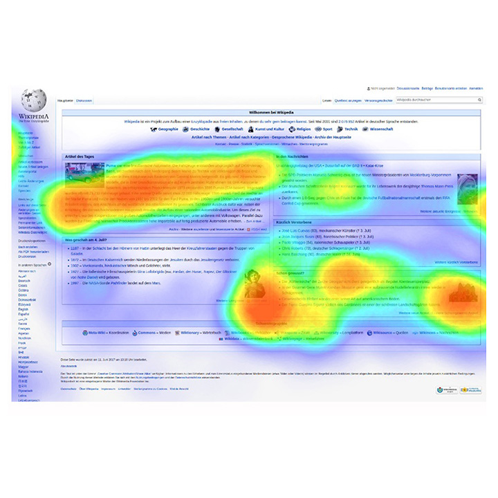
2. Heatmap
A heatmap is a visualization that uses color overlays to represent variation. Traditionally heatmaps were used to show which areas of a city had more crimes. However, it can be used in any type of data. You may even use Microsoft Excel to create heatmaps easily.
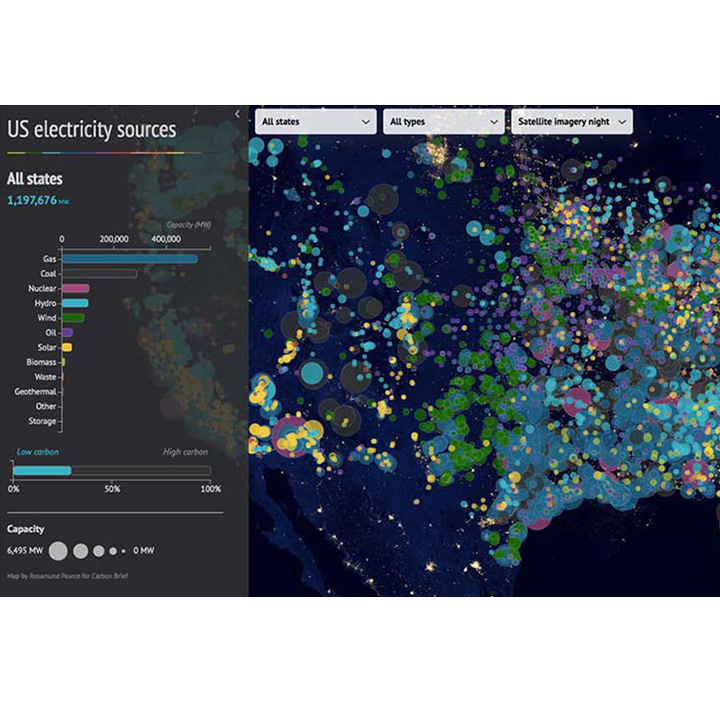
3. Geographical visualization
Geographic visualization is another great technique. Similar to the infographics, it was challenging to create geographic/cartographic visualization. However, with the advent of software like Tableau, it has become much much easier. You can overlay your insights on the map of your country, city, or the world in a matter of minutes.
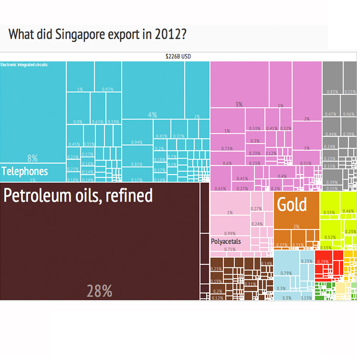
4. Treemap
If you are trained in statistics, you can readily think of treemap as an extension of decision trees. It is a 2D representation of hierarchical data. The data is nested in the form of shapes like rectangles. Each rectangle can be clicked and you can see the data distribution inside that rectangle. Again, this type of visualization can be best made using dedicated data visualization software. However, with a little bit of effort, you can create the same in Powerpoint or Excel.
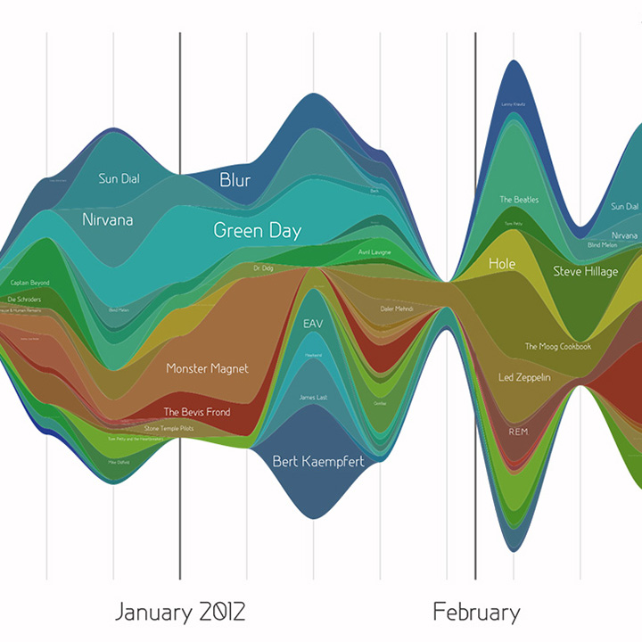
5. Streamgraph
A streamgraph is like a stacked area chart. However, it is created around a horizontal axis. This makes streamgraph look like a flowing stream. Usually, different colors represent different variables. It is the best way to visualize data that is temporal. Temporal or time-varying data changes over time. This trend could be represented well in a streamgraph.
A list of top 20 most common visualization methods
| Serial Number | Chart Type |
|---|---|
| 1 | Bar Chart or Column Chart |
| 2 | Table |
| 3 | Pie-Chart |
| 4 | Line Chart |
| 5 | Area Chart |
| 6 | Pivot Table |
| 7 | Scatter Plot |
| 8 | Area Map |
| 9 | Infographics |
| 10 | Box and whisker plots |
| 11 | Word cloud |
| 12 | Cartogram |
| 13 | Dendogram |
| 14 | Gantt Chart |
| 15 | Stacked area graph |
| 16 | Matrices |
| 17 | Radial charts |
| 18 | Star Diagrams |
| 19 | Fishbone Diagrams |
| 20 | Streamgraph |